


Ever walked into a store that felt instantly welcoming, and couldn’t explain why?
Guess what? It could be the lighting.
That’s right. Lighting is one of the most powerful, yet underestimated, tools in shaping how we experience a space.
Think about it. A beautifully designed space can feel flat under poor lighting, while an ordinary one can come alive with the right balance of brightness, colour, and comfort.
That’s the power of lighting.
When the quality is right, people don’t notice the fixture producing the illumination.
Instead, they notice the atmosphere, the mood, and the clarity it brings.
In this post, we’ll define the key principles that determine lighting quality and visual comfort in commercial interiors.
We’ll go over what they mean, how to achieve them, and why they matter for businesses.
So, buckle up, grab a cuppa or two… we’re diving in.
What Defines Lighting Quality?
Are you familiar with George R.R. Martin’s line in A Feast for Crows that says,
“A sword is only as good as the man who wields it”?
The same can be said with lighting… to an extent.
You see, lighting quality isn’t about how bright a space is, but it’s about how well it’s lit.
Maybe another analogy? Think of it like sound: turning up the volume doesn’t make music better; it’s about clarity, balance, and tone.
In lighting, quality depends on several measurable factors: uniformity, glare, flicker, and colour rendering.
Each affects how people perceive light, how comfortable they feel, and how well they perform visual tasks.
Uniformity
Uniformity refers to the even distribution of light across a surface.
In offices, warehouses, and retail environments, inconsistent levels can lead to fatigue, discomfort, and even accidents.
Uneven lighting means bad lighting.
Taking the time to create a good layout or plan can help you avoid uneven distribution. Most establishments go for a grid design for even illumination.
Glare Rating (UGR)
Glare occurs when a light source is too bright compared to its surroundings, causing discomfort or difficulty seeing.
Have you ever looked directly at the sun out of curiosity? (Do not attempt to do this!) It’s the same as that at a much lower, yet still discomforting, level.
That’s why there’s this thing called Unified Glare Rating (UGR).
It’s basically a numerical measure of glare discomfort. For most commercial spaces, designers generally aim for a UGR of 19 or lower, ensuring that fixtures don’t produce direct glare.
For display or industrial areas where higher brightness is needed, a slightly higher UGR may be acceptable.
Flicker Index (FI)
Flicker refers to rapid, often imperceptible fluctuations in light output.
Yes, just because you can’t see it with your naked eyes, doesn’t mean a light is not flickering.
While older fluorescent lamps were notorious for visible flicker, even modern LED systems can produce subtle modulation due to issues with the driver or dimming.
The flicker index (FI) ranges from 0 to 1, where a lower value indicates less flicker. A flicker index of 0.1 is ideal for visual comfort.
Colour Rendering Index (CRI)
CRI indicates how accurately a light source reveals colours compared to natural daylight.
The index ranges from 0 to 100, with higher numbers indicating that the colours are truer, richer, and more accurate.
A CRI of 80 is acceptable for most interiors, while a CRI of 90 or higher is preferred for retail, hospitality, or art environments where colour fidelity matters.
Together, these parameters define what makes lighting not only functional but also pleasant.
Glare Control & Shielding Techniques
Ah, glare. The nemesis of visual comfort.
You have to remember: lighting is not always about brightness.
Lighting is about contrast. A ceiling of shiny LED panels might flood a space with light, but it can also make it uncomfortable to look up.
To control glare, you can use a combination of the following: optical design, placement, and shielding:
- Recessed or louvred fixtures: These hide the light source from direct view, reducing high-angle brightness.
- Diffusers and prismatic lenses: These spread light more evenly, softening edges and preventing hot spots.
- Indirect lighting: Reflecting light off walls or ceilings creates a gentle, ambient glow that feels natural and inviting. Notice how daylight bounces through a room? The idea is similar to that.
- Proper positioning: Avoid placing lights directly in line with sightlines, such as over desks, screens, or mirrors. (I guess that’s a given.)
A good rule of thumb? If you can see the light source directly, check if it’s supposed to be visible.
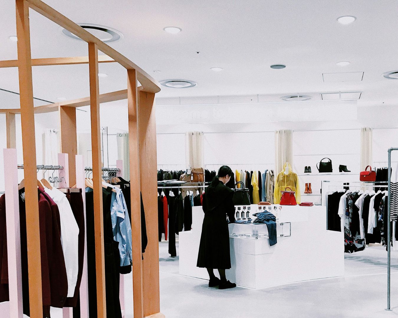
Since we’re talking in a commercial setting, think, for example, of a retail fitting room.
Soft, shadow-free lighting helps customers feel comfortable and confident.
In contrast, harsh downlights can make even flattering clothes look unappealing.
Flicker, Stroboscopic Effects & Fatigue
Even when invisible to the naked eye, flicker can cause subtle but significant effects.
We’re talking about eye strain and fatigue, headaches, and even reduced concentration.
For LED lighting, flicker happens when its power often fluctuates due to poor-quality drivers or incompatible dimming systems.
The lesson here? Don’t skimp on the quality of your lights.
Additionally, stroboscopic effects can cause moving objects (such as machinery or fans) to appear to move erratically, which is a potential safety hazard in workshops or factories.
Things to do to mitigate flicker:
- Use high-quality LED drivers with constant-current output.
- Choose products that have been tested and have passed standards for flicker safety, such as IEEE 1789 or CIE TN 006.
- Ensure dimming controls are compatible, especially in smart or DALI systems where modulation can vary.
Good flicker control isn’t just about compliance; it’s about the well-being of your staff and everyone who is in the vicinity of your business.
In offices, flicker-free lighting can reduce eye strain during long computer sessions.
In retail, it prevents products from appearing to shimmer or distort on camera.
Colour Temperature, Colour Rendering & Spectra
Did you know that the usual orange-y and bluish lights you see in restaurants and clinics are all white light?
Yes. They just have different colour temperatures.
A bit confusing? Let’s break it down:
Colour Temperature
Measured in Kelvin (K), colour temperature determines the “warmth” or “coolness” of light:
- 2700–3000K are the Warm White Lights — Creates an inviting and intimate environment, perfect for hotels or restaurants.
- 3500–4100K are the Neutral or Natural White Lights — Balanced for offices or showrooms.
- 5000K+ are the Cool White Lights — crisp and energising, ideal for hospitals or workshops with high foot traffic.
Each colour temperature can shape the perception of a space.
For example, a fashion boutique with cooler lighting might feel more modern and invigorating, while a restaurant with warmer tones feels cosy and relaxed.
Colour Rendering
High colour rendering index (CRI) lighting ensures colours appear natural under artificial lighting. Skin tones, fabrics, and materials will still look authentic under a light with high CRI ratings (80 or more).
Spectral Quality
Not all LEDs with the same colour temperature are equal. Their spectral distribution, the mix of light wavelengths, affects how materials appear.
Spectral quality affects what can be accurately detected, analysed, and differentiated.
For example, tunable white or full-spectrum LEDs mimic natural daylight, improving both visual and emotional comfort.
In human terms, poor colour quality is like hearing music through a tiny, low-quality speaker; full-spectrum light is like hearing it in high fidelity.
Uniformity & Distribution Across Space
The most beautiful luminaire will fail as a lighting fixture if its light isn’t distributed well.
It’s back to the sword analogy all over again.
Uneven lighting creates “bright islands” and dark corners, making spaces feel disjointed, cramped, or unbalanced.
Horizontal Uniformity
This ensures that work surfaces, like desks or countertops, have consistent illumination. Too much variation causes constant eye adjustment, leading to fatigue.
Vertical Illuminance
Equally important as overhead lights are the lights on the walls.
In offices and shops, well-lit vertical surfaces create depth and reduce contrast between the task area and background.
It’s what makes an office feel open rather than cave-like.
We suggest you use a layered approach when lighting your spaces:
- Ambient lighting for overall brightness.
- Task lighting for focused areas.
- Accent lighting for texture and highlights.
When done well, you don’t even notice the lighting anymore. You only notice the space.
That’s good lighting.
Biophilic & Circadian Lighting Considerations
Modern lighting designs, most especially the Human-Centric Lighting (HCL), go beyond visual performance.
It also supports biological comfort.
Humans evolved under dynamic daylight, not static indoor light after all.
Biophilic Lighting
Biophilic design in lighting mimics the daily changes, direction, and softness of natural light.
This can be achieved by using colour temperature and dynamic intensity shifts.
Some designs even incorporate live plants or natural textures to enhance the effects of biophilic lighting, including improved mood, performance, and reduced stress.
Circadian Lighting
Ever heard of the term “body clock”?
That’s your circadian rhythm. Our bodies are tuned to a 24-hour cycle.
We have evolved to know that when it gets bright, it’s time to wake up, and when it’s dark, it’s time to go to sleep.
In spaces such as offices, hospitals, and schools, artificial lighting can replicate this pattern, supporting both well-being and productivity.
Morning daylight (rich in blue tones) boosts alertness, while evening light (warmer tones) signals rest.
For instance, a workplace might start the day with daylight tones (5000K) and shift to warmer tones (3500K) in the afternoon.
This subtle change mirrors nature, allowing employees to maintain energy without feeling overstimulated.
Example: Comfortable Interior Lighting in UK Spaces
Let’s bring all these things we discussed to life with a few real-world examples of visual comfort done right.
Office Environments
A London co-working space replaces its standard LED panels with micro-prismatic, UGR < 19 light fixtures and adds vertical wall washers for balanced brightness.
The result: reduced screen glare and fewer complaints of eye strain.
They paired this with 4000K neutral white light, which is bright enough for focus, but not glaring.
Retail Stores
In a Manchester boutique, designers use a mix of CRI 90 spotlights and warm 3000K downlights.
High colour rendering ensured fabrics appeared true to life, while accent lighting drew attention to display tables without blinding shoppers.
Restaurants & Hospitality
A Bristol restaurant layers lighting: pendant fixtures for ambience, concealed LED strip lights for depth, and wall washers for texture.
Dimming controls allow staff to shift from bright lunchtime scenes to cosy evening settings: one system, multiple moods.
Healthcare & Education
Hospitals and classrooms across the UK are increasingly adopting circadian lighting systems that adjust the spectrum and intensity throughout the day.
These solutions improve alertness, sleep quality, and mood, which proves that lighting isn’t just about seeing, but feeling better.
These examples demonstrate that visual comfort is not an aesthetic luxury, but rather a performance driver.
Testing & Validation (Light Meters, Software & Standards)
Here’s the good news: lighting quality can be measured. And you should!
Tools like lux (or light) meters measure light intensity and brightness, spectroradiometers evaluate colour quality, and high-speed photodiodes analyse light fluctuations (flicker).
These tools, along with others, help validate design intent and ensure compliance with relevant standards.
Thanks to modern technology, software like DIALux and RELUX can help simulate how light interacts with a space before installation.
This allows fine-tuning for uniformity, glare, and colour balance. This eliminates “trial and error” on lighting.
All of these also ensure that key reference standards are met:
- BS EN 12464-1: Sets requirements for lighting indoor workspaces.
- CIBSE LG7: Covers office lighting design.
- CIE 117 & 190: Glare and luminance evaluation.
- IES LM-79 / LM-80: Performance and lifespan testing of LED products.
Businesses investing in quality lighting gain assurance that employees, customers, and guests will experience the environment as intended.
Conclusion
It can’t be denied that in commercial interiors, lighting is both a science and an art.
There are two sides to commercial lighting: The technical side (uniformity, UGR, CRI, flicker) ensures safety and clarity, while the human side (warmth, softness, rhythm) creates connection and comfort.
A well-lit environment doesn’t draw attention to the fixtures; it draws attention to the experience.
When good lighting is implemented, people feel at ease, colours look vibrant, and the space flows naturally.
For businesses, this means more than aesthetics. It means better employee performance, happier customers, and a stronger brand identity.
That’s why at Simple Lighting, we believe that quality lighting isn’t a luxury.
It’s a foundation.
And what better way to strengthen this foundation than expanding your knowledge in Lighting Your Business: Offices, Shops & Commercial Spaces?


